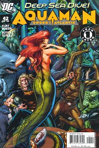
Overdue Review - Aquaman #42
Aquaman: Sword of Atlantis #42: "Deep Down": It really would be difficult to convey how much glee this issue gave me. And not all for just story reasons. I have been really enjoying this revamp and this issue was, in my opinion, great from start to finish.
I like how the status of Atlantis is explained. I love seeing parts of the undersea world from an outsider's point of view (Arthur's delight at the food and drink was a lovely touch). I love the fractured nature of the ocean civilizations once Poseidonis was destroyed, and I love seeing the underside of that world, the parts that Orin rarely entered. An undersea bar? Great! I love the Windward Home, and especially the view from below. I love seeing the old heroes return, like The Sea Devils, Red Torpedo (Jimmy Lockhart), and the variety of folks gathered at the Windward Home. And I LOVED the last page, even if the character wasn't drawn quite right.
And that's where I'll start on my complaints. I felt the coloring was too dark in many places, and would've preferred some brighter colors just for ease of reading. I also loved Guice's design for the bar... but we only see it clearly in a single panel, right before it's destroyed. I think I would've liked to see it more than that. And I wish the colors had made it look different than the trench wall it was clinging to. Same with the town. It's hard to tell that that opening scene is a town. Colors would make a HUGE difference here, but I wish Butch would give us a few more close-ups as well later on.
The only other major art problem is with the character on the final page. He just doesn't look quite right in robes. For obvious reasons, Atlanteans generally don't wear robes or dresses unless they are making a statement. So seeing that character in robes didn't look quite right. Not a big nit, but it did throw me.
So to sum up: Loved the story, loved most of the art, I think the color needs a bit of work (and some contrast in the backgrounds), and was absolutely delighted by the final page.
Labels: Butch Guice, Kurt Busiek, Reviews


